Ma, Silence, and Meaning
Japanese visuals often feel too quiet.
Not because nothing is happening, but because something is being deliberately left behind.
In Japanese art, design, or film, what many people call “negative space” is hardly ever accidental. In many cases, it plays a structural role. It creates rhythm, produces tension, and invites the audience not into simple reception of information, but into participation.
To understand this, it helps to move away from the idea that meaning must always be stated, filled, or explained.
Not emptiness, but structure
In many visual traditions, clarity is achieved by adding information: more detail, more explanation, more emphasis. Japanese visual culture often takes the opposite approach. Meaning is strengthened by removal.
This doesn’t mean minimalism for its own sake. Empty space in Japanese visuals is not decorative silence. It functions as a frame, a pause, or a breath. The image is not incomplete; it is intentionally unfinished in a way that allows meaning to emerge.
This logic appears across media, from traditional prints to modern graphic design, photography, and film.
What is ma ?
The concept most often associated with this approach is ma (間).
Ma is frequently translated as “space” or “interval,” but those translations are incomplete. Ma refers less to physical emptiness and more to timing, distance, and the relationship between elements. It is the pause between sounds, the gap between movements, the moment before something happens.
Importantly, ma is not passive. It is active potential.
In visual terms, ma is the area that allows forms to breathe. It is where the viewer’s attention settles before moving on. Rather than telling the viewer what to feel, ma gives them time to feel it themselves.
Why absence carries meaning
Japanese visuals often assume that the viewer is capable of interpretation. This assumption changes how images are constructed.
Instead of guiding attention with constant signals, the image creates a situation and steps back. Absence becomes meaningful because it invites the viewer to fill the gap with their own perception, memory, or emotion.
This can feel unfamiliar to viewers from cultures where visual communication prioritizes clarity, emphasis, and explanation. In those contexts, empty space may feel like something is missing. In Japanese visuals, that “missing” space is often the point.
From ukiyo-e to modern design
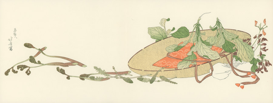
This logic is visible in ukiyo-e prints, where large areas of sky, water, or blank background are not filler but compositional anchors. These spaces stabilize the image while directing attention toward specific forms.
Rather than centering everything, many prints use asymmetry and openness. The subject may be pushed to the edge of the frame, balanced by a wide, quiet area. The result feels dynamic, not sparse.
Modern Japanese graphic design inherits this logic. White space is treated not as background but as an active element. Text and images are allowed to exist without being enclosed or crowded. The page feels intentional, not empty.
Photography and film: silence as composition
In photography, this approach often appears as restraint. The frame includes only what is necessary, and sometimes what is not included matters more than what is shown.
A subject may be small within the frame. A scene may feel paused. Rather than directing emotion through dramatic emphasis, the image allows atmosphere to accumulate slowly.
Japanese cinema often extends this principle into time. Long shots, quiet scenes, and moments where nothing “important” happens are not wasted space. They create emotional context. They allow the audience to notice details, textures, and rhythms that would disappear in faster editing.
Silence, both visual and auditory, becomes part of the composition.
Why this can feel unsettling—or calming
For some viewers, this approach feels calming. For others, it feels unsettling. Both reactions are understandable.
When meaning is not spelled out, the viewer is asked to stay present. There is no shortcut. The image does not rush to reassure or explain itself.
This difference reflects a deeper cultural contrast. In many contexts, information density is equated with kindness or clarity. In Japanese visual culture, restraint can be a form of trust. The creator trusts the viewer to look, wait, and interpret.
Empty space becomes a shared responsibility between image and observer.
Empty space isn’t empty
What looks like absence in Japanese visuals is often a carefully shaped presence. It holds timing, directs attention, and gives meaning room to form.
Rather than filling every corner, these visuals leave space for breath, pause, and thought. The result is not silence for silence’s sake, but a different way of speaking—one that says less, so that more can be felt.
Leave a Reply